Build a canvas
Create a canvas, add widgets, and learn the actions every widget shares.
A canvas is the dashboard surface where widgets live. Most widgets read from a data object, so a canvas always reflects your current records rather than a static snapshot. This page covers creating a canvas, adding widgets, configuring them, and the actions every widget shares. Each widget type then has its own page for its full set of options. For the mental model behind canvases, see Core concepts: Canvas.
Create a canvas
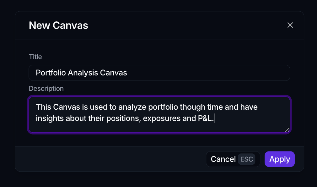
- In the sidebar, open the Canvas section.
- Click New at the top right.
- In the New Canvas dialog, fill in Title and Description.
- Click Apply.
The canvas is created and opens straight away in edit mode, ready for its first widget. A bottom toolbar appears with the widget controls.
Add a widget
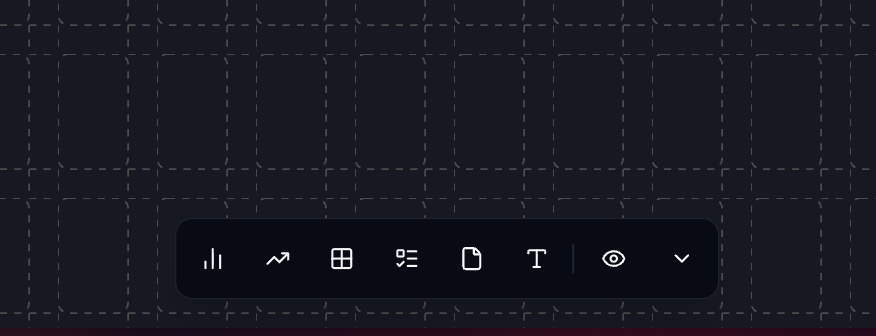
In edit mode, use the bottom toolbar to add a widget:
- Add chart (⌘1)
- Add KPI (⌘2)
- Add table (⌘3)
- Add tasks (⌘4)
- Add text (⌘5)
- Add custom view
These use ⌘ on Mac and Ctrl on Windows (so ⌘1 is Ctrl+1), and only add a widget while you're already in edit mode.
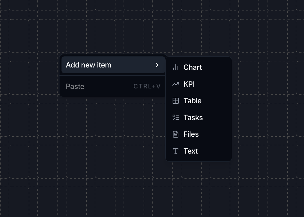
You can also right-click empty space on the canvas and choose Add new item to pick a widget type from the menu.
The widget catalog
Each widget type has its own page with the full set of options:
| Widget | What it shows | Page |
|---|---|---|
| Chart | A visual series: bar, line, area, pie or radar. | Chart |
| KPI | A single aggregated number, such as a count or a sum. | KPI |
| Table | Rows and columns from a data object, with optional editing. | Table |
| Lookthrough | A table whose rows open into the records beneath them, level by level. | Lookthrough |
| Tasks | A filtered list of tasks. | Tasks |
| Files | A filtered list of files. | Files |
| Text | Free-form headings and notes, with no data binding. | Text |
Configure a widget
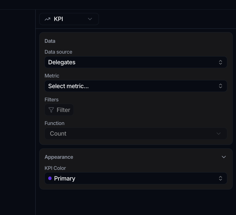
Adding a data widget opens its editor; you can reopen it any time in edit mode by clicking the widget's header. The editor is a split view: a live preview on the left and a configuration panel on the right.
Name the widget from the info bar above the panel: click the title to rename it (it shows Untitled until you do), and add an optional description (No description until you do). KPI widgets have a title only.
The configuration panel is organized into collapsible sections. Which appear depends on the widget type, but the common ones are:
- Data holds the Data source and the type-specific fields. The data source is a data object; to scope a widget to a slice of it, use the filters and sort below rather than picking a saved view here. A table or KPI added before you pick a data source shows an empty state rather than a broken card, so an unfinished widget is obvious while you build.
- Filters & Sorting reuses the same builder as data views: a Filters section (including advanced boolean logic) and a Sort by section. See Manage data views.
- Appearance holds the visual options, which differ by type (chart type, colors, KPI color, and so on).
A type selector at the top of the panel converts a widget between Chart, KPI, Table, Tasks and Files without rebuilding it.
Let a widget size itself
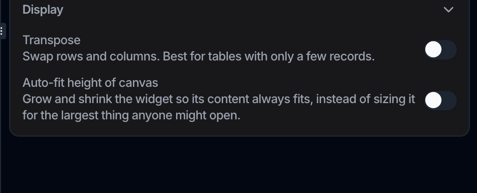
Table, tasks and files widgets have an Auto-fit height of canvas switch under Display. Turn it on and the card takes the height its content needs instead of the number of grid rows you drew, up to a ceiling past which the content scrolls. The panel puts it plainly: it grows and shrinks the widget so its content always fits, instead of sizing it for the largest thing anyone might open.
It is the setting for anything that grows: a task list people keep adding to, or a table whose rows arrive later. Without it you either leave a screen of empty space against the day the widget is full, or watch the content overflow its card.
Actions every widget shares
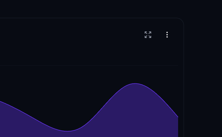
In view mode, hover a widget (or open its ⋮ menu) for these actions. Exactly which appear depends on the type:
- Expand opens the widget in a large modal so you can read it at full size. Tables page through more rows there. (KPIs, text and custom views don't expand.)
- Export Chart downloads the widget's displayed data as a CSV: the aggregated values you see (chart or KPI) or the visible rows (table, tasks, files).
- Export Data downloads the underlying records behind a chart or KPI as a CSV, with the widget's filters and sort applied.
- Export card saves the whole widget as a PNG image.
Text and custom-view widgets don't expose the export menu.
Arrange and edit widgets
In edit mode, right-click a widget for Cut (⌘X), Copy (⌘C), Paste (⌘V), Duplicate (⌘D) and Delete. Chart widgets also get a Chart Options submenu here for their display toggles. To move or resize widgets, see Layout.
Save and exit
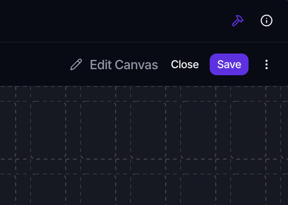
Edits are staged until you save. The top-right edit banner has:
- Save (⌘S) to persist your widgets and layout. When several widgets are pending it reads Save (N), and you can Discard changes on one or Discard all.
- Close to leave edit mode. If you have unsaved changes, a Discard changes? prompt appears first.
To edit the canvas again later, click Edit Canvas in the top-right banner, or use ⌘E (which toggles edit mode).
Where to go next
- Configure each widget type, starting with the Chart
- Focus a canvas on different slices: Context variables
- Arrange and resize widgets: Layout
- Show work alongside numbers: Create a task