Chart
Plot your data as a bar, line, area, pie or radar chart.
A chart turns a data source into a visual series. You choose what goes on the category axis, which values to plot, how to aggregate them, and how the chart looks. For the shared editor mechanics, see Build a canvas.
Set the data
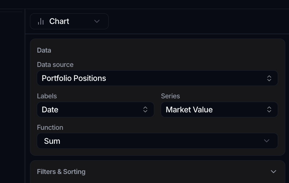
In the Data panel:
- Set the Data source to the object the chart reads from.
- Set Labels to the attribute that forms the category axis (the grouping). This is a single choice.
- Set Series to the values to plot. You can pick more than one attribute to draw several series at once.
- Pick a Function to aggregate each series.
The Function options are None, Count, Count distinct, Sum, Avg, Min and Max. The numeric functions (Sum, Avg, Min, Max) are only available when every selected series is a number. Both Labels and Series can reach across relationships, so you can group or plot by an attribute on a linked object.
Split into one series per value
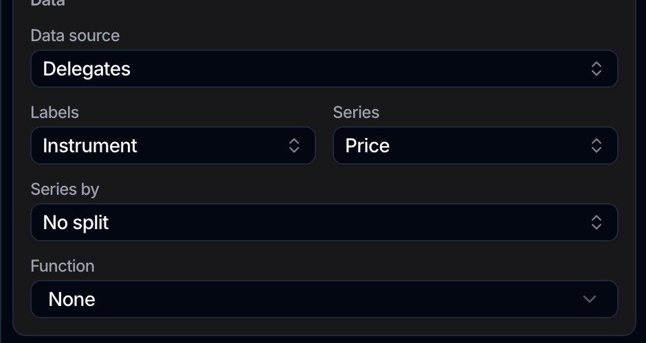
Labels sets the category axis and Series sets what is plotted, which leaves a common shape unanswered: a table of date, instrument and price has three columns, and plotting price against date collapses every instrument into one line.
Series by is the third column. It sits in the Data panel and starts at No split. Pick a column and the chart draws one series per distinct value it holds, so that table becomes one line per instrument.
- A Select or relationship column splits by its readable value, not by an id.
- A Multi-select column fans out rather than partitions: a record holding two values contributes to both series, so the series do not add up to the total. The chart warns you where you pick it.
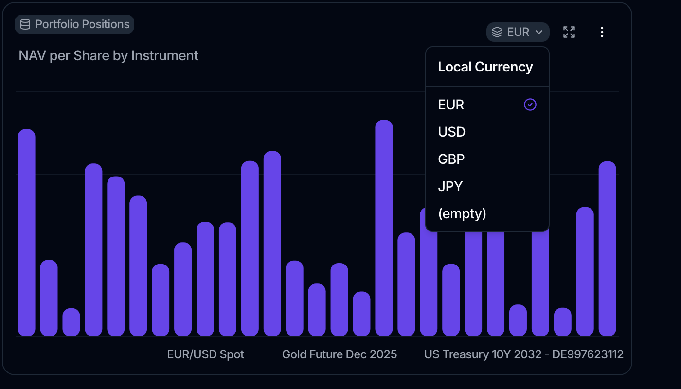
Once a chart is split, a badge in its header lets a viewer flip between the values without changing the saved chart. The badge is named after the column that did the splitting and shows the value you are on; its menu lists every value, plus (empty) for the records that have none. It works the way the Date range badge does: it changes what you are looking at, not what everyone else sees.
Choose the chart type
In the Appearance panel, set the Chart type. The available types are:
- Bar
- Line
- Area
- Pie (with an As Donut option)
- Radar
Appearance options
The options change with the chart type. Each is a simple on/off toggle unless noted:
| Chart type | Options |
|---|---|
| Bar | Orientation (Vertical or Horizontal), Axes, Labels, Stacked, Legend |
| Line | Curve Type (Natural, Linear or Step), Axes, Dots, Labels, Legend |
| Area | Curve Type (Natural, Linear or Step), Axes, Stacked Expanded, Legend |
| Pie | Labels, As Donut, Legend |
| Radar | Dots, Lines Only, Hide Grid, Legend |
For line, bar, area and radar charts, a Series colors group lets you set a color per series.
Line, area and bar charts also offer Start at zero. Off by default, it extends the value axis down to zero instead of fitting it around the values you plotted, and the zero baseline becomes visible along with it.
It matters whenever the height of a bar is doing the arguing. An axis fitted to values between 95 and 105 makes a 10% spread look like a collapse; starting at zero puts the difference back in proportion. It also gives a series that crosses zero somewhere to cross. Pie and radar charts have no value axis to anchor, so they do not offer it.
You can also set it from the right-click Chart Options menu in view mode.
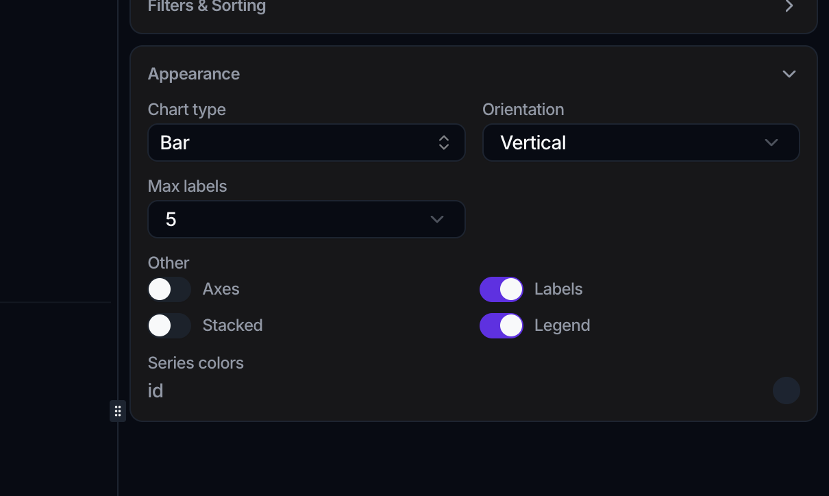
You can also change these display toggles without opening the editor: in view mode, right-click the chart and use the Chart Options submenu, where each option is set to Enabled or Disabled.
Limit the number of labels
To keep a busy chart readable, the Appearance panel has a Max labels option that caps how many categories the chart shows. It keeps the largest categories by value and rolls the rest into a single Others entry.
- On bar, line, area and radar charts, choose All (the default) to show every category, or 5, 10, 15, or 20.
- Pie charts always cap labels: the choices are 5, 10 (the default), 15, or 20.
You can also set Max labels from the right-click Chart Options submenu in view mode.
Focus on a date window
When a chart's category axis is a date or datetime, bar, line and area charts show a Date range option in place of Max labels. It limits the chart to a recent window:
- All time (the default)
- Last 7 days, Last 30 days, Last 90 days
- Last 6 months, Last 12 months
- Month to date, Year to date
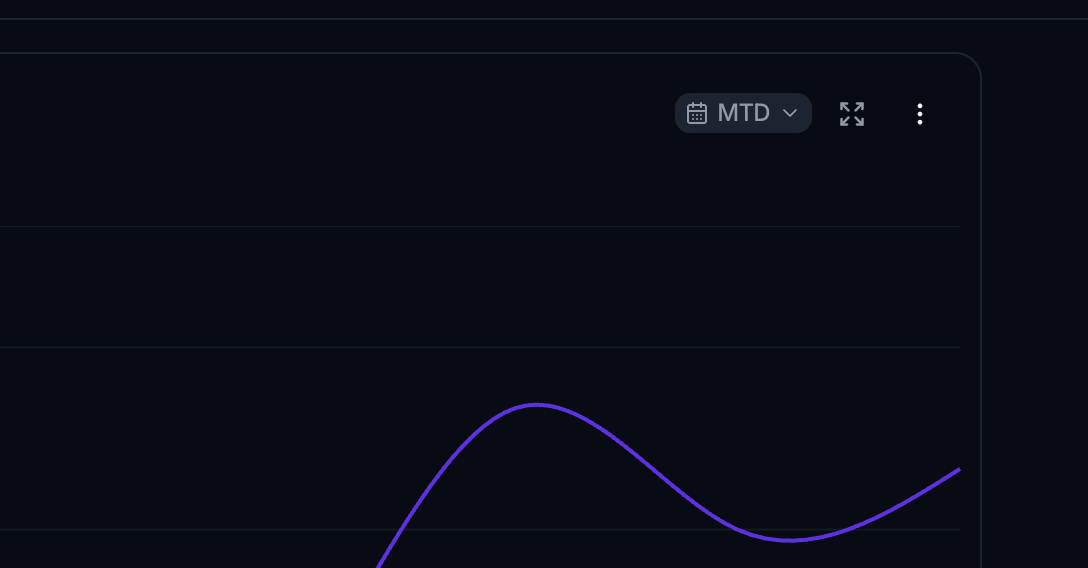
The window is anchored to the latest data point in the series, not to today, so a chart whose data ends last week still shows its final days. A Date range badge also appears on the chart in view mode: click it to preview a different window without changing the saved chart.
How numbers are formatted
A chart formats each series with that attribute's own display configuration, the one set in Data on the attribute itself: its format, decimal places, separators, and any prefix, suffix or multiplier. The formatting is applied consistently across the chart's axis ticks, its on-chart labels and its tooltips, and it is per series, so a percentage plotted next to a currency each keep their own precision.
Large values are still shortened for readability, but only where shortening does not cost you precision you asked for. A value configured as a percentage to four decimals is shown that way rather than rounded away.
A chart holds the configuration as it was when the series was picked, and Spark keeps that snapshot current when you change the attribute in Data. To set or change the formatting, go to the attribute, not the chart: see Format how a number displays.
A series that reads through a relationship keeps the formatting it had when you picked it. If you change the formatting of an attribute you are plotting through a link and the chart does not follow, re-pick the series.
What the axis shows
Two things worth knowing about how the value axis is drawn. Records with no value for a series are left out of the calculation rather than counted as zero, so one empty month no longer drags an axis down to meet it. And a smooth curve stays within the values you plotted: it will not dip below your lowest point to make the line prettier.
Filter and sort
The Filters & Sorting panel scopes the chart with the same Filters and Sort by builder used on data views. It also has a Cast Datetime into Date option, useful when you want to group a datetime attribute by day rather than by the exact timestamp.
When you don't set an explicit Sort by, the chart sorts its category axis in ascending order automatically: dates run oldest to newest and text runs alphabetically, with any Others bucket pinned last. Add a Sort by to override this.
Export
Exports carry the raw values rather than the formatted ones. From the chart's ⋮ menu in view mode you can Export Chart (the plotted values as a CSV), Export Data (the underlying records as a CSV), or Export card (the chart as a PNG). Expand opens the chart in a large modal. See Build a canvas.